Night shots often look great in the viewfinder but change after capture. Many users ask a clear question: why do pictures shift so much? The root is aggressive processing and a small phone sensor that pushes color and contrast in low light.
This short guide sets expectations. You will get a repeatable slider workflow for the native editor first, then an option to move to advanced apps if needed.
The goal is not to flatten the image. Instead, we bring back natural tone, contrast, and highlight detail while keeping the night mood. You’ll use simple adjustments: Exposure, Highlights, Shadows, Whites, Contrast, plus a tone curve.
We’ll explain why processing happens, give a step-by-step sequence, list the best tools, and share quick prevention settings. Each step includes a practical example so you know what to watch for on-screen and when to stop.
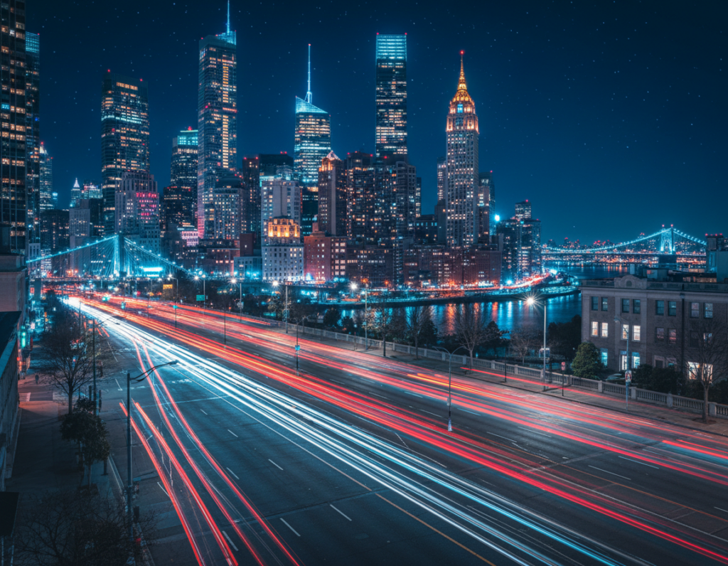
Why smartphone night photos look oversaturated and “over-processed”
When light is scarce, the camera leans on software tricks that change how a photo feels. Mobile devices merge multiple frames to boost detail, but that multi-frame HDR-like approach can push saturation and micro-contrast so the shot “pops.”
Low light + HDR processing
- Multi-frame blending raises detail but may also drive up color and contrast around bright sources.
- The classic failure: bright lights clip and spill color while deep shadows are crushed, so the final image looks harsh.
- If highlight recovery does not succeed, the phone compensates by amplifying contrast and color, increasing the over-processed look.
Display vs image
On some phones, View Full HDR makes the saved image appear brighter and more intense on screen. Toggling that setting often changes how photos look, so a user should check the option before assuming a bad capture.
Exposure compensation and mode choices
Exposure Compensation (EC) can stay set across Photo or Portrait mode and push exposure, contrast, and saturation too high. Switching modes or lenses also triggers different processing pipelines at the same level of light.
Quick diagnostic: if the preview looked fine but the saved photo feels worse, the problem is likely processing or display rendering — not the lens. The next section shows a practical slider workflow to calm these issues without just sliding Saturation down.
fix oversaturated colors night photography smartphone editing with a simple slider workflow
Start with a calm, ordered approach: one slider at a time and a clear goal for the image. Open your phone’s native app first so edits stay fast and nondestructive.
Start in your phone’s native editing app before downloading anything
Open the photo, tap Edit, and work in a consistent order. This prevents chasing random sliders and often solves the issue without extra tools.
Pull back Exposure and Brightness to calm the overall light
Reduce Exposure first to tame the overall intensity that makes colors feel aggressive. Use Brightness next to dial glare down while preserving midtone detail.
Recover Highlights to reduce blown light sources and neon color spill
Pull the highlights slider down to restore detail in streetlights, signs, and reflections. This step often reduces weird color edges by unclipping bright areas.
Lift Shadows carefully to restore detail without creating gray haze
Lift Shadows just enough to reveal building and clothing detail. Stop before the scene turns flat; too much lift creates a gray veil that harms the mood.
Rebalance Contrast and Black Point so colors stop “popping” unnaturally
After highlights and shadows, add or remove Contrast to neutralize exaggerated tones. Then set Black Point to re-anchor depth without crushing shadow detail.
Use Whites strategically for cleaner night tones without reintroducing clipping
Use the Whites control to tidy bright non-light areas like pavement. Move it slowly and check clipping so you don’t undo the highlight recovery.
Fine-tune with a tone curve to control highlights and midtones more naturally
Finish by pulling down the top-right of the curve a little to soften the brightest stops. Nudge midtones for a smoother roll-off and more natural gradation.
- Stop test: after each step, zoom on the brightest light source and a deep shadow to confirm improved detail and color.
- If you need more power, try dedicated apps; see a roundup of the best photo apps for more tools.
Best apps and tools for quick fixes on iPhone and Android
Not every tool is equal — pick one that matches how much control and time you have. Below are practical choices so a user can get the right result fast.
Apple Photos / Google Photos: fastest route for simple corrections. Try this quick sequence: Exposure down, Brightness down slightly, Highlights down, then a small Black Point nudge. This flow calms blown lights and restores natural midtones.
Lightroom Mobile: use this when you need deeper control. Work Exposure → Highlights → Contrast → Whites, then finish with a subtle tone curve to smooth highlight roll-off. Lightroom gives precise sliders and preserves more detail.

Canva: best for social posts. Its foreground/background edits let you reduce bright signs or sky without flattening the whole image.
VSCO is ideal for gentle film-like looks; pull the Exposure slider slightly left and add a light vignette. Instagram’s Lux can overdo contrast — move it left and apply a muted filter (New York, Oslo, Juno, Slumber) with lower intensity.
For targeted work, use Photoshop Express or Darkroom. Both offer masking, luminance controls, and subject selection to tame specific areas like neon or faces.
“Choose quick editors for time, and pro apps for precision.”
- Decision rule: Apple/Google for speed; Lightroom for precision; Canva/Instagram for social-ready images.
- Need examples or presets? See a short guide on recommended tools.
Prevent oversaturated night photos before you edit
A few quick camera checks before you press the shutter cut down heavy processing later. These steps help the user keep the saved picture closer to what they saw in the preview. Spend a minute on each item and you’ll spend less time fixing images afterward.
Check Exposure Compensation in Photo and Portrait modes
Open the camera and find the EC indicator or mini histogram. Reset the level to zero for both modes so extra exposure does not force heavy highlight compression.
Reduce aggressive processing via settings
Turn off Photos > “View Full HDR” if photos look more intense on screen. Review other camera settings that alter tone and sharpening so the user sees a truer preview.
Shoot RAW and use Live Photos when needed
When the phone pipeline is the problem, use a third-party camera (Lightroom is a common pick) to capture RAW. Expect more storage and more time to work the file, but you keep more details.
Use Live Photo > Edit > choose a different Key Photo if the saved picture looks worse than the preview.
“Reset EC, test lenses, and keep software current to limit surprises.”
- Example: on a street scene with LED signs, switch lens and keep exposure neutral to reduce color spill and crushed shadows.
- Keep software updated and retest after a settings reset; updates can change processing behavior.
One-minute checklist: EC = 0, View Full HDR off, Live Photo ready, RAW option set, update checked. Run this before a shoot and most problems never appear.
Conclusion
The quickest path to better results is a short tonal checklist you can repeat.
Start by treating exposure, highlights, and contrast as the primary issue, then address any color shifts. Follow this order: Exposure/Brightness → Highlights → Shadows → Contrast/Black Point → Whites → optional tone curve for smooth roll-off.
Begin in your native editor for speed and consistency. Move to Lightroom, Photoshop Express, or Darkroom only when you need masking or finer control.
For prevention, reset exposure compensation to zero, check display HDR options like “View Full HDR,” and use RAW or Live Photo key-frame selection when processing alters results most.
Practical next step: pick one recent night shot, run the workflow once, save that version as a reference, and reuse it for consistent outcomes.